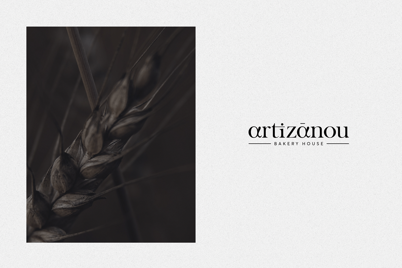
Total visual communication redesigning for ‘’Artizanou bakery house’’ stores.
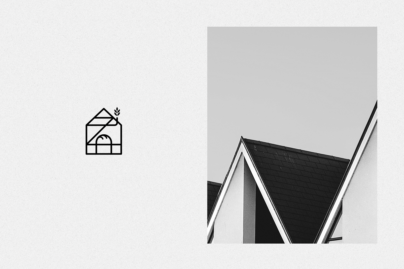
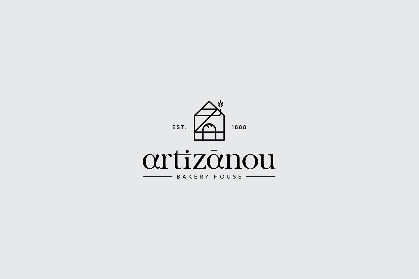
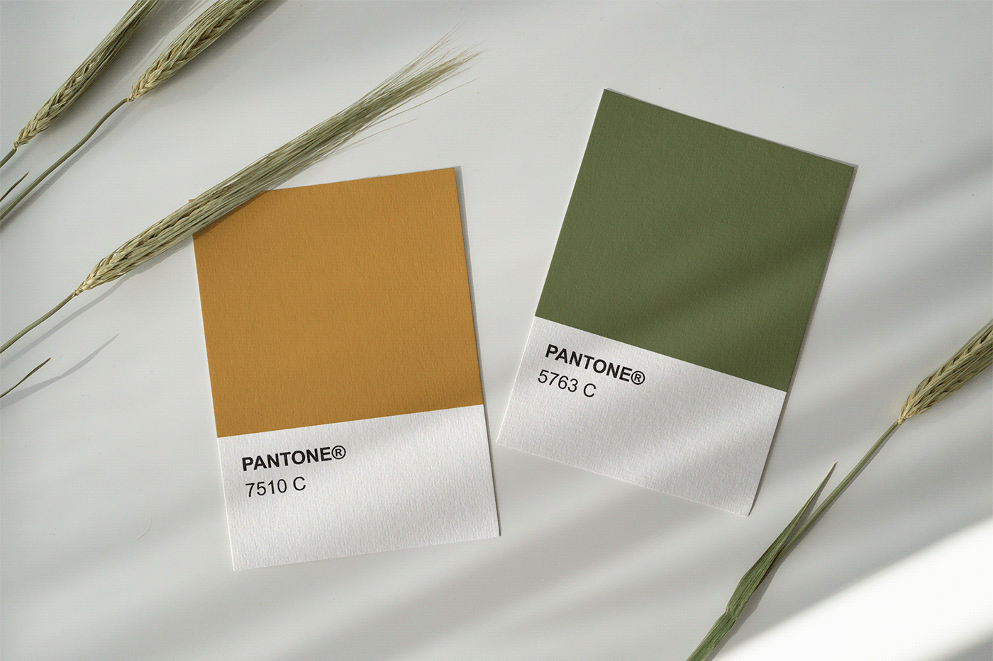
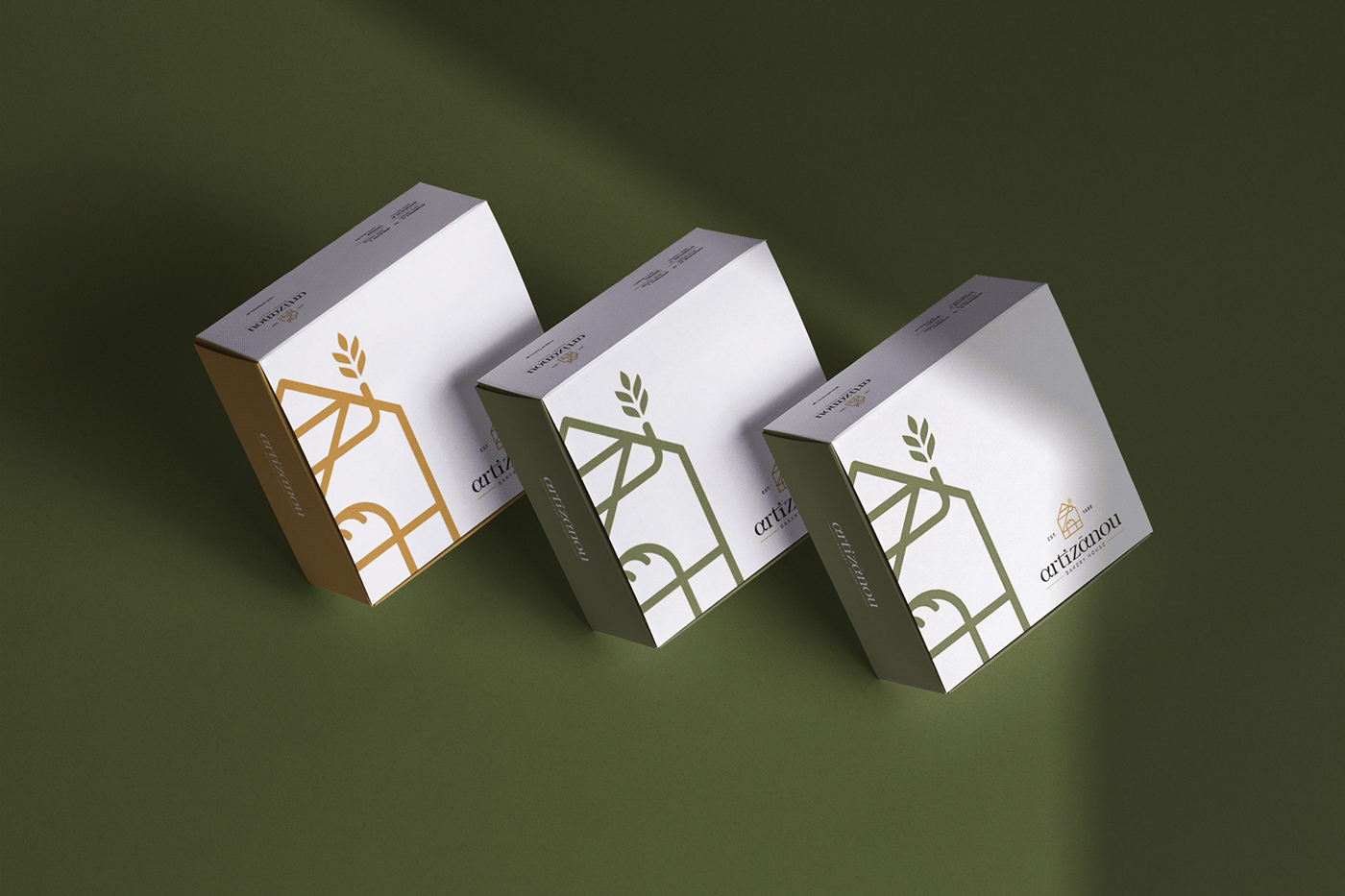
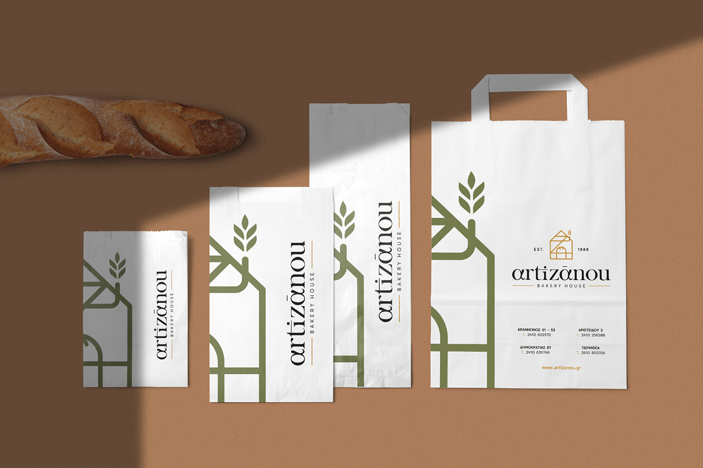
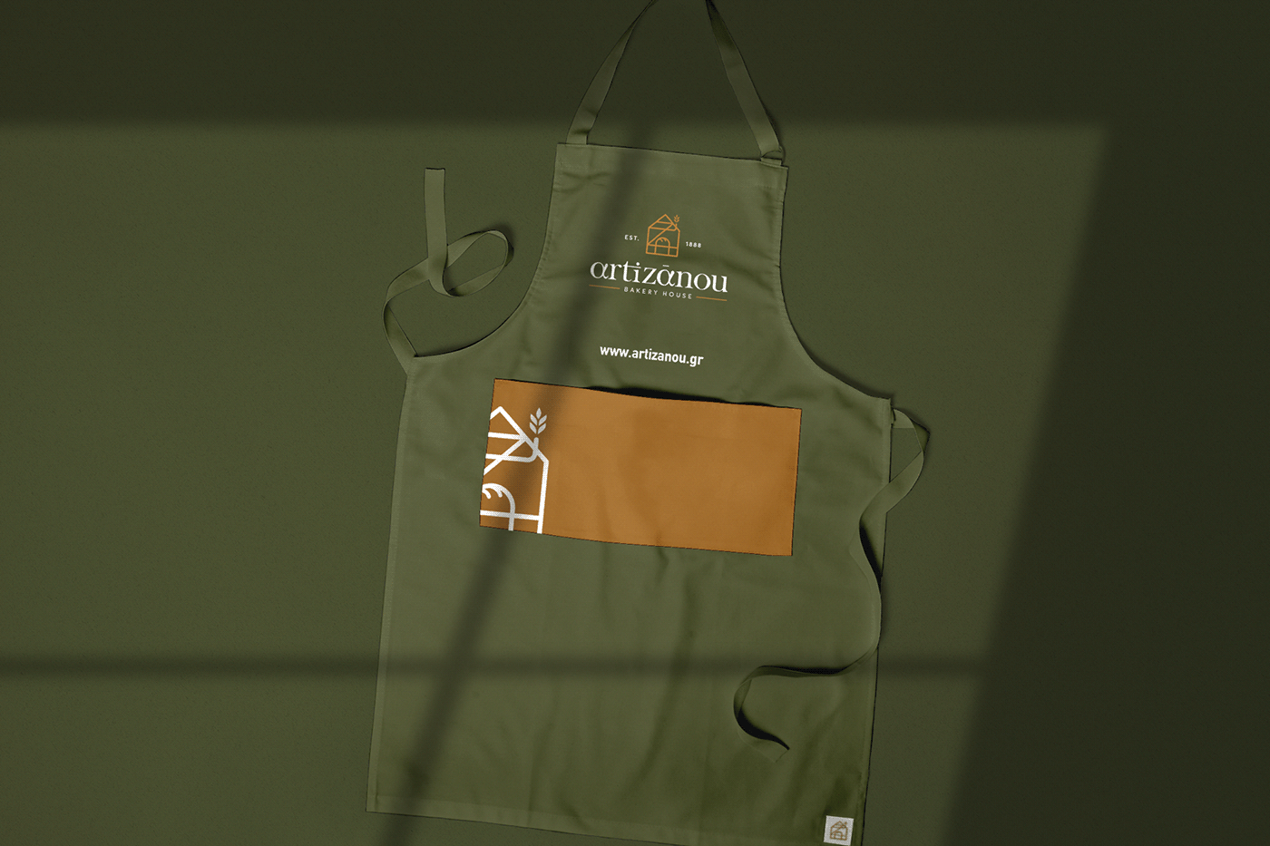
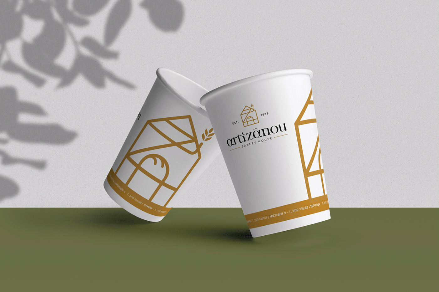
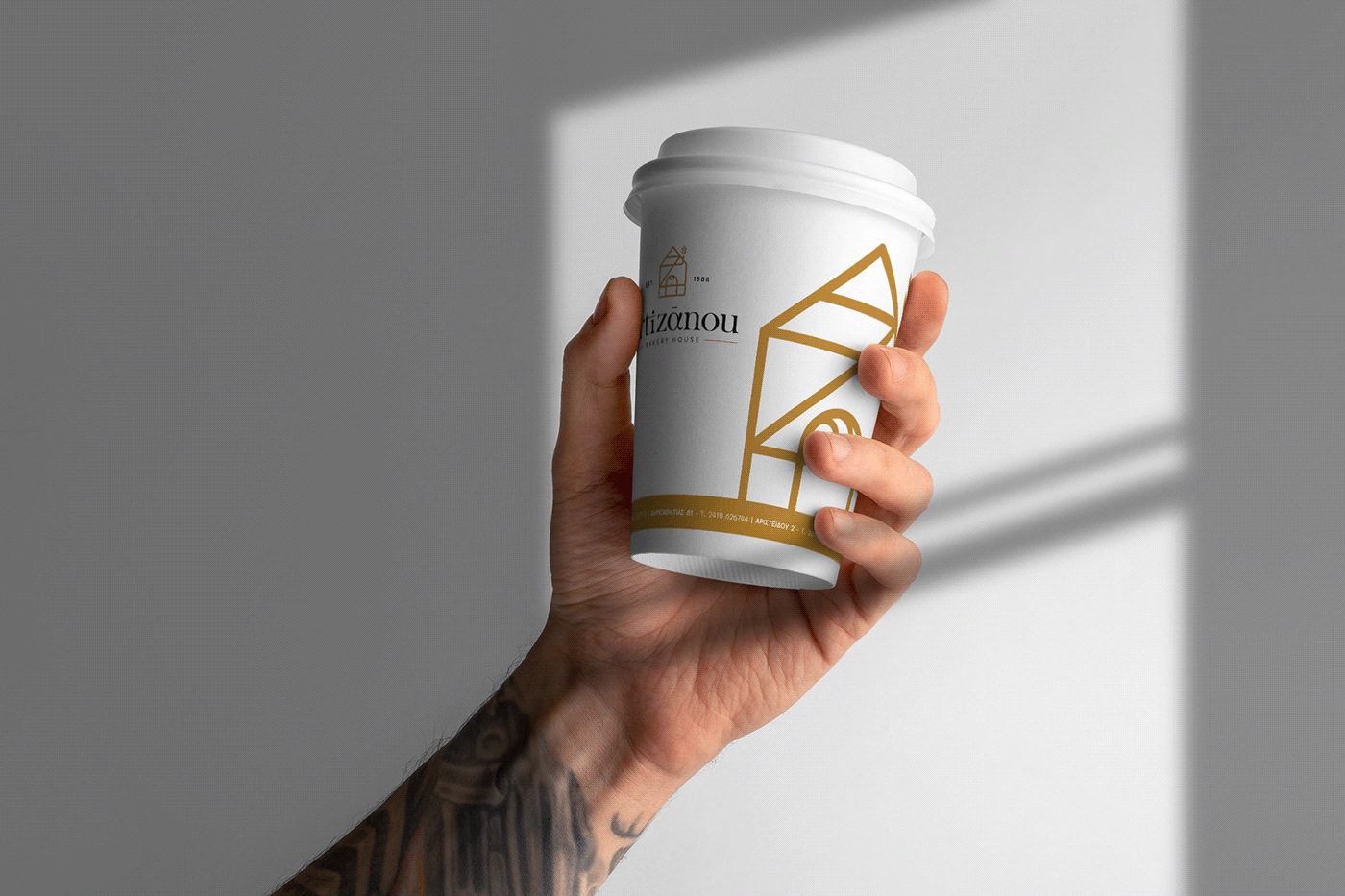
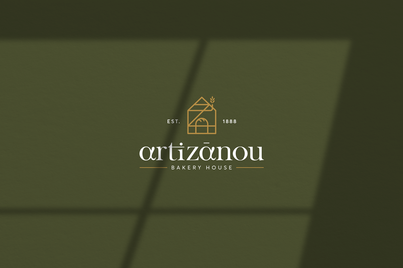
We based the fresh identity on an abstract-geometric logotype. Α familiar icon, once drew by each and every one of us: a small house. This one though encloses the initials A and Z of the brand name, while emits comfort and warmth. The color pallet consisted by a combination of terrestrial green and wheat gold. All these elements performed in an architectural style, both in the corporate identity and the packaging (snack and bread bugs, sweet and cookie boxes, paper coffee cups and take away cases) as well as throughout a variety of special applications.
Communicating cordiality and tastefulness, with a discreet touch of luxury, the rebranding will escort the Artizanou flavors in to your homes.